March 3, 2026 · 2 min read
How to Create an Interactive Map from Excel
A step-by-step guide for turning Excel data into an interactive map without rebuilding everything in a design tool.
Excel is still where a huge amount of regional data starts. Sales by state, headcount by country, support volume by region, and campaign performance by market often live in spreadsheets long before they become dashboards.
The good news is that you do not need a GIS workflow to turn that data into an interactive map.
What your Excel sheet needs
At minimum, you need:
- one geographic column
- one value column
Example:
| Region | Revenue | | --- | --- | | California | 120000 | | Texas | 98000 | | New York | 115000 |
Your geographic column can be country names, states, counties, provinces, or custom regions depending on the map scope.
Step 1: Clean the region names
Before importing your file, check for:
- inconsistent abbreviations
- duplicate rows
- blank values
- alternate spellings
This is the step that makes or breaks the final map.
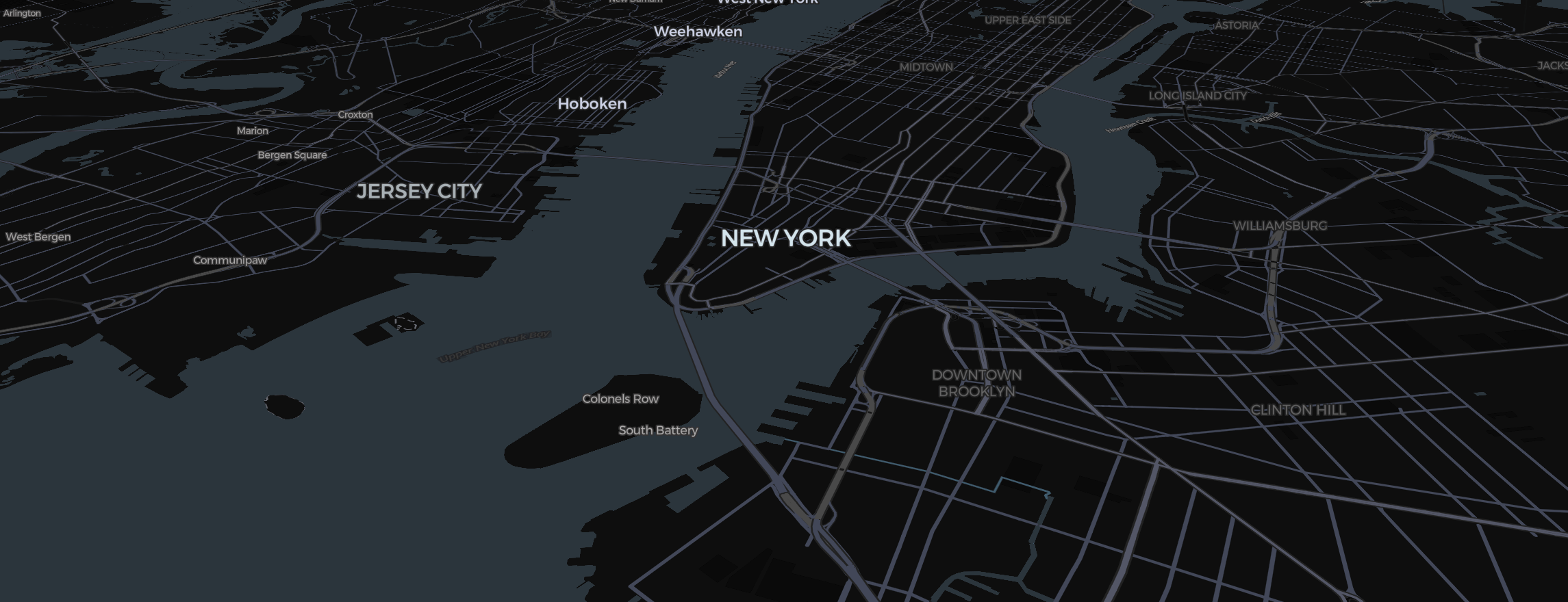
Step 2: Pick the right map type
Different data needs different visual treatment:
- Use a choropleth map for one value per region
- Use categorical fills for grouped statuses or segments
- Use bubbles or symbols for point-based data
Do not default to a choropleth if your values represent locations rather than areas.
Step 3: Import the spreadsheet
Once the data is cleaned, import the file into your map tool and map:
- the geography field
- the metric field
- any optional category, label, or tooltip fields
This is where a spreadsheet-first tool saves time. You should not need to manually redraw anything.
Step 4: Check matching errors
After import, review unmatched regions immediately. Common issues include:
UKvsUnited KingdomUSvsUnited States- trailing spaces
- mixed region levels in the same column
Fix these early so your output is trustworthy.
Step 5: Style for clarity
Interactive maps are most useful when they are easy to read. Focus on:
- a restrained color scale
- visible legends
- short tooltips
- labels only where necessary
Avoid over-design. The map should explain the data, not distract from it.
Step 6: Publish in the format you need
From one source spreadsheet, you may need:
- an internal dashboard embed
- a static image for a report
- a shared link for review
That is why output flexibility matters as much as data import.
Common mistakes
The most common problems are:
- importing messy geographic labels
- using the wrong map type
- applying too many colors
- skipping validation after import
All four make the map less credible.
Final takeaway
If your data already lives in Excel, the fastest route to an interactive map is not a heavy analytics stack. It is a workflow built around spreadsheet imports, region matching, and clean exports.
That is exactly the use case Map2Chart is designed to support.